What’s Your Type?

This post is quick and to the point!
We need to make our fundraising appeals easy to read by the oldest demographic of our communities.
Don’t make your donors run out to CVS to get a stronger pair of reading glasses! LOL!
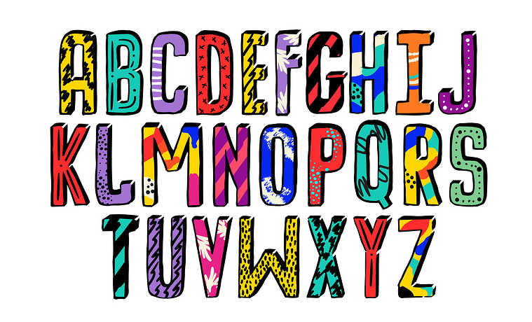
Choose a type font that’s large enough to be read comfortably by most people.
Never use reversed print. White type on a black background is cruel on our eyes. Give us a break!
Make your message more readable by using a serif font in print and a sans serif font on your digital messaging.
It’s simple. Let’s not over complicate it, thinking it’s the design that matters the most. Spending time on over-designing your appeal may be more costly than you think!